Python 可視化神器Plotly詳解

文 | 潮汐
來源:Python 技術(shù)「ID: pythonall」
學(xué)習(xí)Python是做數(shù)分析的最基礎(chǔ)的一步,數(shù)據(jù)分析離不開數(shù)據(jù)可視化。Python第三方庫中我們最常用的可視化庫是 pandas,matplotlib,pyecharts, 當(dāng)然還有 Tableau,另外最近在學(xué)習(xí)過程中發(fā)現(xiàn)另一款可視化神器-Plotly,它是一款用來做數(shù)據(jù)分析和可視化的在線平臺,功能非常強(qiáng)大, 可以在線繪制很多圖形比如條形圖、散點(diǎn)圖、餅圖、直方圖等等。除此之外,它還支持在線編輯,以及多種語言 python、javascript、matlab、R等許多API。它在python中使用也非常簡單,直接用pip install plotly 安裝好即可使用。本文將結(jié)合 plotly 庫在 jupyter notebook 中來進(jìn)行圖形繪制。
使用 Plotly 可以畫出很多媲美Tableau的高質(zhì)量圖,如下圖所示:


折現(xiàn)點(diǎn)圖畫圖步驟如下:首先在 Pycharm 界面輸入 jupyter notebook后進(jìn)入網(wǎng)頁編輯界面,新建一個文件,導(dǎo)入相應(yīng)的包即可進(jìn)行圖形繪制:
# import pkgfrom plotly.graph_objs import Scatter,Layoutimport plotlyimport plotly.offline as pyimport numpy as npimport plotly.graph_objs as go
#設(shè)置編輯模式plotly.offline.init_notebook_mode(connected=True)
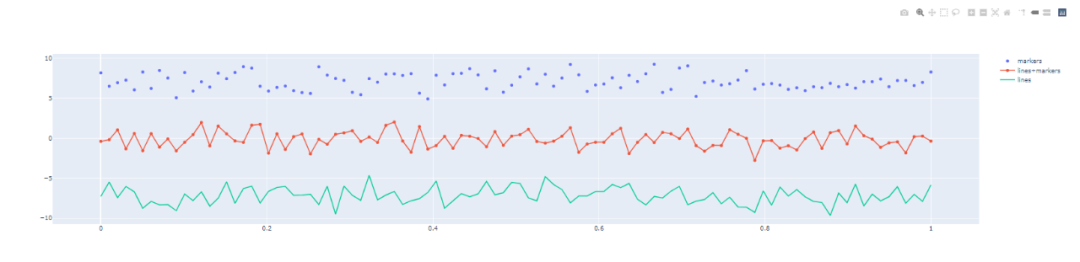
#制作折線圖N = 150random_x = np.linspace(0,1,N)random_y0 = np.random.randn(N)+7random_y1 = np.random.randn(N)random_y2 = np.random.randn(N)-7 trace0 = go.Scatter( x = random_x, y = random_y0, mode = ’markers’, name = ’markers’)trace1 = go.Scatter( x = random_x, y = random_y1, mode = ’lines+markers’, name = ’lines+markers’)trace2 = go.Scatter( x = random_x, y = random_y2, mode = ’lines’, name = ’lines’)data = [trace0,trace1,trace2]py.iplot(data)
顯示結(jié)果如下:
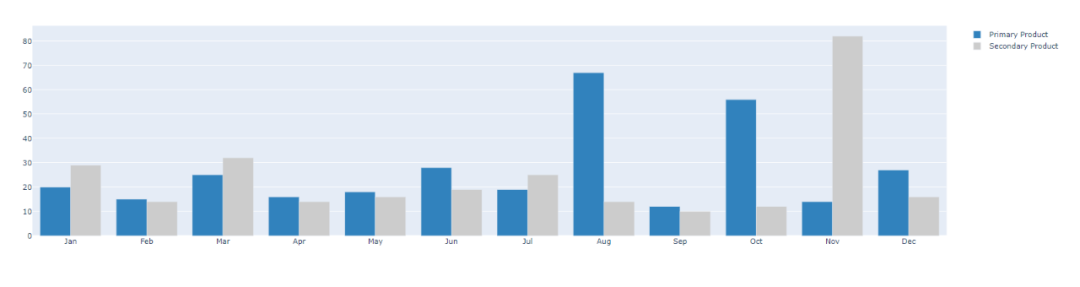
# 直方圖trace0 = go.Bar( x = [’Jan’,’Feb’,’Mar’,’Apr’, ’May’,’Jun’, ’Jul’,’Aug’,’Sep’,’Oct’,’Nov’,’Dec’], y = [20,15,25,16,18,28,19,67,12,56,14,27], name = ’Primary Product’, marker=dict( color = ’rgb(49,130,189)’ ))trace1 = go.Bar( x = [’Jan’,’Feb’,’Mar’,’Apr’, ’May’,’Jun’, ’Jul’,’Aug’,’Sep’,’Oct’,’Nov’,’Dec’], y = [29,14,32,14,16,19,25,14,10,12,82,16], name = ’Secondary Product’, marker=dict( color = ’rgb(204,204,204)’ ))data = [trace0,trace1]py.iplot(data)
顯示結(jié)果如下:
散點(diǎn)圖
# 散點(diǎn)圖trace1 = go.Scatter( y = np.random.randn(700), mode = ’markers’, marker = dict( size = 16, color = np.random.randn(800), colorscale = ’Viridis’, showscale = True ))data = [trace1]py.iplot(data)
顯示結(jié)果如下:

今天的文章主要學(xué)習(xí)可視化神器-plotpy 的相關(guān)操作,希望在平時的工作中有所應(yīng)用。更多的內(nèi)容詳見 https://plotly.com/python/
到此這篇關(guān)于Python 可視化神器Plotly詳解的文章就介紹到這了,更多相關(guān)Python 可視化神器Plotly內(nèi)容請搜索好吧啦網(wǎng)以前的文章或繼續(xù)瀏覽下面的相關(guān)文章希望大家以后多多支持好吧啦網(wǎng)!
相關(guān)文章:
1. IntelliJ IDEA創(chuàng)建web項(xiàng)目的方法2. 存儲于xml中需要的HTML轉(zhuǎn)義代碼3. python numpy中setdiff1d的用法說明4. HTTP協(xié)議常用的請求頭和響應(yīng)頭響應(yīng)詳解說明(學(xué)習(xí))5. python基礎(chǔ)之匿名函數(shù)詳解6. ASP中實(shí)現(xiàn)字符部位類似.NET里String對象的PadLeft和PadRight函數(shù)7. Python多線程實(shí)現(xiàn)支付模擬請求過程解析8. ASP.NET MVC通過勾選checkbox更改select的內(nèi)容9. Python Request類源碼實(shí)現(xiàn)方法及原理解析10. python實(shí)現(xiàn)與redis交互操作詳解

 網(wǎng)公網(wǎng)安備